Setup Dark & Light Mode for your Next.js application using Shadcn

Hi There, today we will see how we can setup the dark mode for the Next.js application using shadcn.
1.What is Shadcn
Shadcn UI is not specifically a component library or UI framework. As stated in the documentation, it is described as a "compilation of reusable components" that can be easily copied and pasted in your applications
Shadcn leverages Tailwind css and Radix UI as it's foundation.It presently offers compatibility with Next.js, Gatsby, Remix, Astro, Laravel, and Vite.
2.Installation
Create a new Next.js application with the following command
npx create-next-app@latest my-app --typescript --tailwind --eslint
Once the application is created navigate to the application using the cd command and then initialize the shadcn-ui command to init the project
npx shadcn-ui@latest init
Configure the component.json file (You will be asked few questions to configure the component.json file)
Would you like to use TypeScript (recommended)? no / yes
Which style would you like to use? › Default
Which color would you like to use as base color? › Slate
Where is your global CSS file? › › app/globals.css
Do you want to use CSS variables for colors? › no / yes
Are you using a custom tailwind prefix eg. tw-? (Leave blank if not) ...
Where is your tailwind.config.js located? › tailwind.config.js
Configure the import alias for components: › @/components
Configure the import alias for utils: › @/lib/utils
Are you using React Server Components? › no / yes
Once the initialization is completed you can add the components from shadcn like below
npx shadcn-ui@latest add button
where you can see the button component gets created in the components directory like below
.
├── app
│   ├── layout.tsx
│   └── page.tsx
├── components
│   ├── ui
│   │   ├── alert-dialog.tsx
│   │   ├── button.tsx
│   │   ├── dropdown-menu.tsx
│   │   └── ...
│   ├── main-nav.tsx
│   ├── page-header.tsx
│   └── ...
├── lib
│   └── utils.ts
├── styles
│   └── globals.css
├── next.config.js
├── package.json
├── postcss.config.js
├── tailwind.config.js
└── tsconfig.json
Once the button component is installed you can use it in your component or page like below
import { Button } from "@/components/ui/button"

export default function Home() {
  return (
    <div>
      <Button>Click me</Button>
    </div>
  )
}
You can see the shadcn components section to see the list of components that is available.
3.Adding Dark mode
Now we will move on to the interesting part that is adding the darkmode for your application
Install the next-themes using the following command
npm install next-themes
Inside your components directory create a new file named theme-provider.tsx and then add the following code
"use client"

import * as React from "react"
import { ThemeProvider as NextThemesProvider } from "next-themes"
import { type ThemeProviderProps } from "next-themes/dist/types"

export function ThemeProvider({ children, ...props }: ThemeProviderProps) {
  return <NextThemesProvider {...props}>{children}</NextThemesProvider>
}
Now go to your app layout.tsx file and then wrap it with the ThemeProvider which you have created like below
import { ThemeProvider } from "@/components/theme-provider"

export default function RootLayout({ children }: RootLayoutProps) {
  return (
    <>
      <html lang="en" suppressHydrationWarning>
        <head />
        <body>
          <ThemeProvider
            attribute="class"
            defaultTheme="system"
            enableSystem
            disableTransitionOnChange
          >
            {children}
          </ThemeProvider>
        </body>
      </html>
    </>
  )
}
Now go to the components directory and create a new component named model-toggle.tsx and then add the below code
"use client"

import * as React from "react"
import { Moon, Sun } from "lucide-react"
import { useTheme } from "next-themes"

import { Button } from "@/components/ui/button"
import {
  DropdownMenu,
  DropdownMenuContent,
  DropdownMenuItem,
  DropdownMenuTrigger,
} from "@/components/ui/dropdown-menu"

export function ModeToggle() {
  const { setTheme } = useTheme()

  return (
    <DropdownMenu>
      <DropdownMenuTrigger asChild>
        <Button variant="outline" size="icon">
          <Sun className="h-[1.2rem] w-[1.2rem] rotate-0 scale-100 transition-all dark:-rotate-90 dark:scale-0" />
          <Moon className="absolute h-[1.2rem] w-[1.2rem] rotate-90 scale-0 transition-all dark:rotate-0 dark:scale-100" />
          <span className="sr-only">Toggle theme</span>
        </Button>
      </DropdownMenuTrigger>
      <DropdownMenuContent align="end">
        <DropdownMenuItem onClick={() => setTheme("light")}>
          Light
        </DropdownMenuItem>
        <DropdownMenuItem onClick={() => setTheme("dark")}>
          Dark
        </DropdownMenuItem>
        <DropdownMenuItem onClick={() => setTheme("system")}>
          System
        </DropdownMenuItem>
      </DropdownMenuContent>
    </DropdownMenu>
  )
}
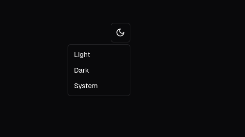
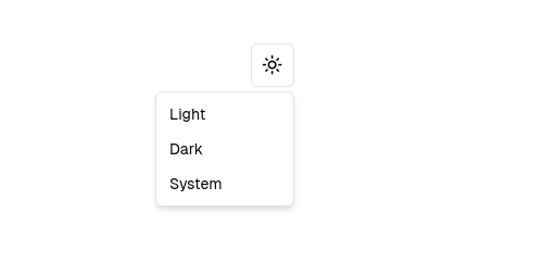
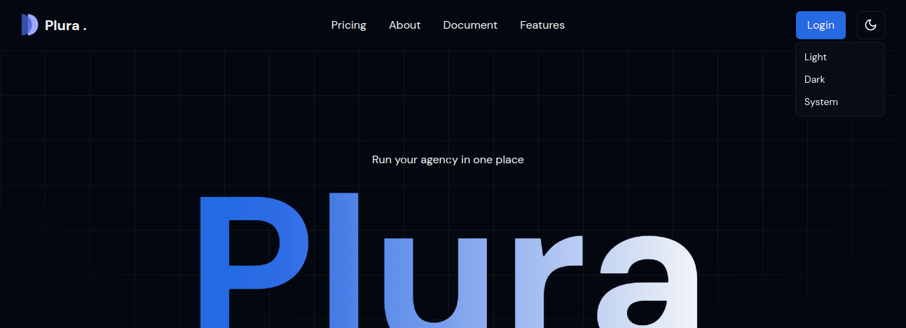
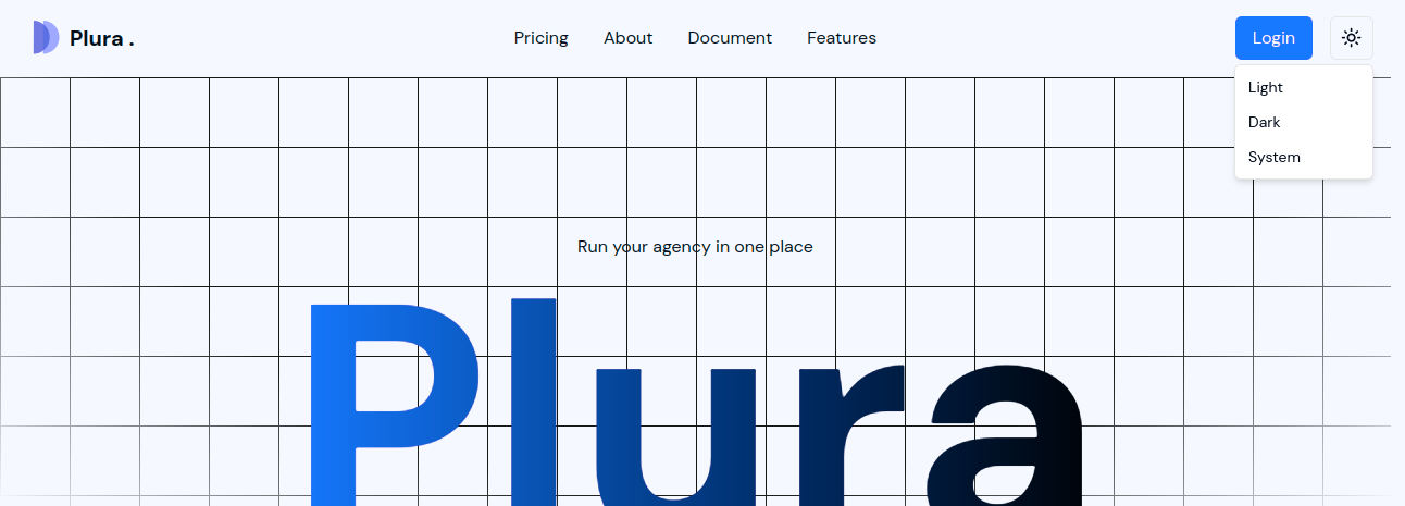
The above code will create a toggle button with light, dark and system themes like below
Now add this ModelToggle component in your Navigation like this
Well that's it we have seen how to setup the theme provider as well as the dark mode for your Next.js application using shadcn.
Will Catchup in a new post till then Happy Learning !!!