CSS — Gallery Layouts

If you don’t have time to read but want to know what’s there in this post. Find the quick read 👇
On this Post
In this post, we are going to look at some of the commonly used Gallery Layouts.
The Layouts which we are going to see in this post are
Responsive image mosaic
Masonry Layout
3-tile layout
1. Responsive Image Mosaic
To create a responsive mosaic layout we will be using the Grid layout. First, we will create a mosaic layout like below
Next, we will create the necessary CSS required for the mosaic layout
.image-mosaic {
    display: grid;
    gap: 1rem;
    grid-template-columns: repeat(auto-fit, minmax(240px, 1fr));
    grid-auto-rows: 240px;
    }
.card {
display: flex;
flex-direction: column;
justify-content: center;
align-items: center;
background: #353535;
font-size: 3rem;
color: #fff;
box-shadow: rgba(3, 8, 20, 0.1) 0px 0.15rem 0.5rem, rgba(2, 8, 20, 0.1) 0px 0.075rem 0.175rem;
height: 100%;
width: 100%;
border-radius: 4px;
transition: all 500ms;
overflow: hidden;
background-size: cover;
background-position: center;
background-repeat: no-repeat;
padding: 0;
margin: 0;
}
Now we will use the **grid-row: span 2 / auto** and **grid-column: span 2 / auto** to create items that span two rows or two columns respectively.
@media screen and (min-width: 600px) {
 .card-tall {
  grid-row: span 2 / auto;
 }

.card-wide {
  grid-column: span 2 / auto;
 }
}
Now we will have the mosaic layout like below
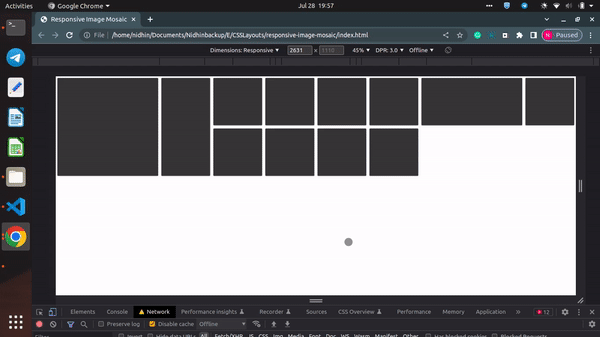
Now if needed, you can add images to each div element and can get the final output like below
2. Masonry Layout
Now will construct a masonry-style arrangement of “bricks” that perfectly match one another and have either a fixed width (vertical layout) or a predetermined height (horizontal layout). Particularly beneficial when dealing with photos.
Now will create
**masonry container**this is the container for the**masonry layout**and**.masonry-columns**, an inner container in which**.masonry-brick**elements will be placed.Apply
**display: block**to**.masonry-brick**elements to allow the layout to flow properly.Use the
**:first-child**pseudo-element selector to apply a different margin for the first element to account for its positioning.Use CSS variables and media queries for greater flexibility and responsiveness.
<div class="masonry-container">
        <div class="masonry-columns">
            <img class="masonry-brick" src="https://picsum.photos/id/564/1200/800" alt="picsum image" />
            <img class="masonry-brick" src="https://picsum.photos/id/566/800/530" alt="picsum image" />
            <img class="masonry-brick" src="https://picsum.photos/id/575/800/530" alt="picsum image" />
            <img class="masonry-brick" src="https://picsum.photos/id/626/800/530" alt="One more picsum image" />
            <img class="masonry-brick" src="https://picsum.photos/id/667/800/530" alt="And picsum one" />
            <img class="masonry-brick" src="https://picsum.photos/id/1074/384/216" alt="Last picsum image" />
        </div>
    </div>
The final CSS for the masonry layout will look like below
/* Container */
.masonry-container {
--column-count-small: 1;
--column-count-medium: 2;
--column-count-large: 3;
--column-gap: 0.125rem;
padding: var(--column-gap);
}

/* Columns */
.masonry-columns {
column-gap: var(--column-gap);
column-count: var(--column-count-small);
column-width: calc(1 / var(--column-count-small) * 100%);
}

@media only screen and (min-width: 640px) {
.masonry-columns {
column-count: var(--column-count-medium);
column-width: calc(1 / var(--column-count-medium) * 100%);
}
}

@media only screen and (min-width: 800px) {
.masonry-columns {
column-count: var(--column-count-large);
column-width: calc(1 / var(--column-count-large) * 100%);
}
}

/* Bricks */
.masonry-brick {
width: 100%;
height: auto;
margin: var(--column-gap) 0;
display: block;
}

.masonry-brick:first-child {
margin: 0 0 var(--column-gap);
}
3. 3-tile layout
To create a 3-tile layout we will use the **display: inline-block** to align elements horizontally.
To build a tiled layout without utilizing float, flex, or grid, use
**display: inline-block**.To evenly divide the container’s width into 3 columns, use width in conjunction with calc.
Set
**font-size**for**.tiles**to**0**to avoid whitespace and to**20px**for**<h2>**elements to display the text.
Note: If you use relative units (e.g. em), using **font-size: 0** fight whitespace between blocks might cause side effects.
<div class="tiles">
        <div class="tile">
            <img src="https://via.placeholder.com/200x150">
            <h2>Tile 1</h2>
        </div>
        <div class="tile">
            <img src="https://via.placeholder.com/200x150">
            <h2>Tile 2</h2>
        </div>
        <div class="tile">
            <img src="https://via.placeholder.com/200x150">
            <h2>Tile 3</h2>
        </div>
    </div>
CSS for 3 tile layout
.tiles {
    width: 600px;
    font-size: 0;
    margin: 0 auto;
}
.tile {
    width: calc(600px / 3);
    display: inline-block;
}
.tile h2 {
    font-size: 20px;
}
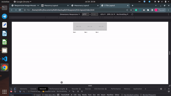
Demonstration of 3tile-layout
Congratulations!
In this post, we have seen the commonly used Gallery layouts such as Responsive Mosaic, Masonry, and 3-tile layouts.
Will catch up in a new post with more interesting crafts till then Happy Learning :)