CSS Layout Patterns #6
If you don’t have time to read but want to know what’s there in this post. Find the quick read 👇

On this Series
We are going to look at the commonly used CSS layout patterns. Most of the patterns which we are going to see use CSS grid and flexbox to achieve the common UI patterns such as cards, dynamic grid areas, and full-page layouts supported on all modern browsers.
The patterns which we are going to see in this series are
Aspect ratio Image Card
Clamping Card
Deconstructed Pancake
Holy grail layout
Line up
Pancake Stack
RAM (Repeat, Auto, Minmax)
Sidebar says something
Super centered
12-span grid
Autobot
Container query card
Content center
Fluffy center
Gentle flex
Pop n’ Plop
If you are new to this series check out the Part 5👇
On this Post
In this post, we are going to see the following patterns that are
Autobot
Container query card
1. Autobot
A centering technique where an element pushes equally from all edges of a flex container. Best for quick centering for single items only.
.autobot {
  display: flex;
}
.autobot > * {
  margin: auto;
}
The container is set to flex with no alignment styles, while the direct children are styled with auto margins. The margin: auto working on all sides of the element.
Though it is a fun trick which is quick and dirty but it will be awkward when the elements overflow. Being pushed into position doesn’t seem optimal and can result in a change to child’s box size.
Autobot will be great for centering icons or psuedo elements.

2. Container Query Card
Container queries are a new CSS feature. They let websites shift away from designs based on page size to a container-based approach, part of a larger evolution in the design ecosystem.
Containers allow you to add styles to elements, like font sizes, colors, and layout widths, based on the parent container. This is a whole new approach to responsive design, which formerly relied on the viewport size.
For instance, on a website where an element is in a hero section or a grid on a page, the element will change sizes based on the container, not the viewport.
Container queries use breakpoints similar to how media queries do. The big difference is that the @container responds to its parent container, while @media follows the viewport and user agent.
To create the container, first set containment on the parent:
.container {
  container-name: myContainer;
  container-type: inline-size;
  /* You can also use the shorthand property `container: myContainer / inline-size`.
}
The following example shows how the card goes from a single-column layout at more narrow sizes to a two-column layout when it is at wider sizes.
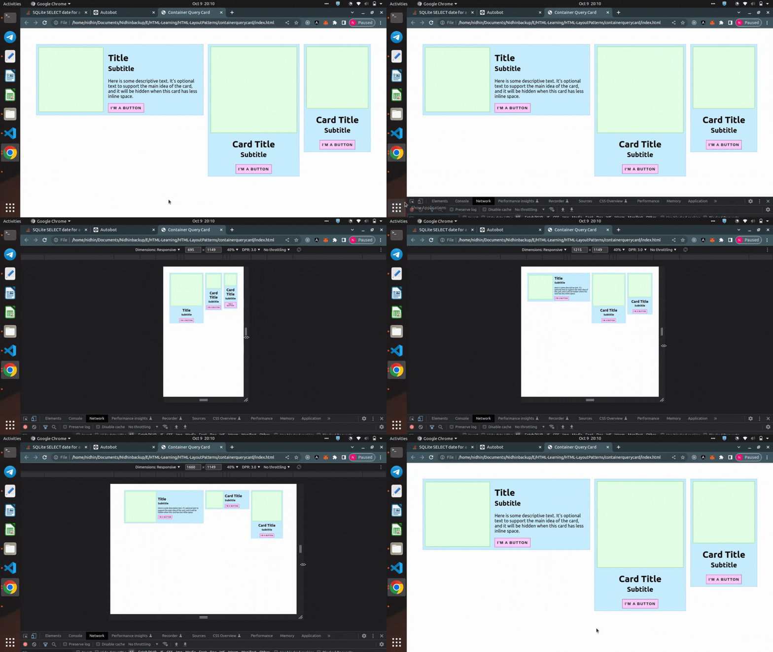
Container Queries
/* 2-column grid layout at >=350px */
@container (min-width: 350px) {
.card {
  display: grid;
  grid-template-columns: 40% 1fr;
  align-items: center;
  gap: 1rem;
  text-align: left;
 }
}

/* Display description at >=500px */
@container (min-width: 500px) {
.desc {
  display: block;
 }
}
This means that if you have this exact same component in different parts of your UI, it’s able to use its own logic to resize and best fit its container. You have better control over the card’s layout than you would if you only had the global viewport to rely on.
Container queries are supported in few browsers

Congratulations!!!

Checkout the Part7 of CSS Layout series 👇


